Everything is Physical: The Art of Digital Mapping
Instructor: Mimi Onuoha
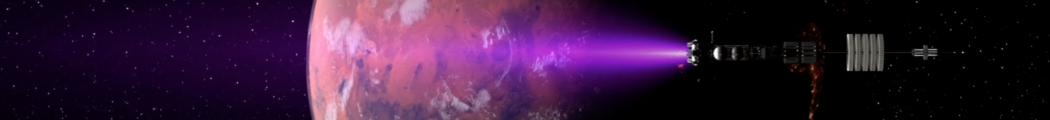
Final Project: Things Worth Saving
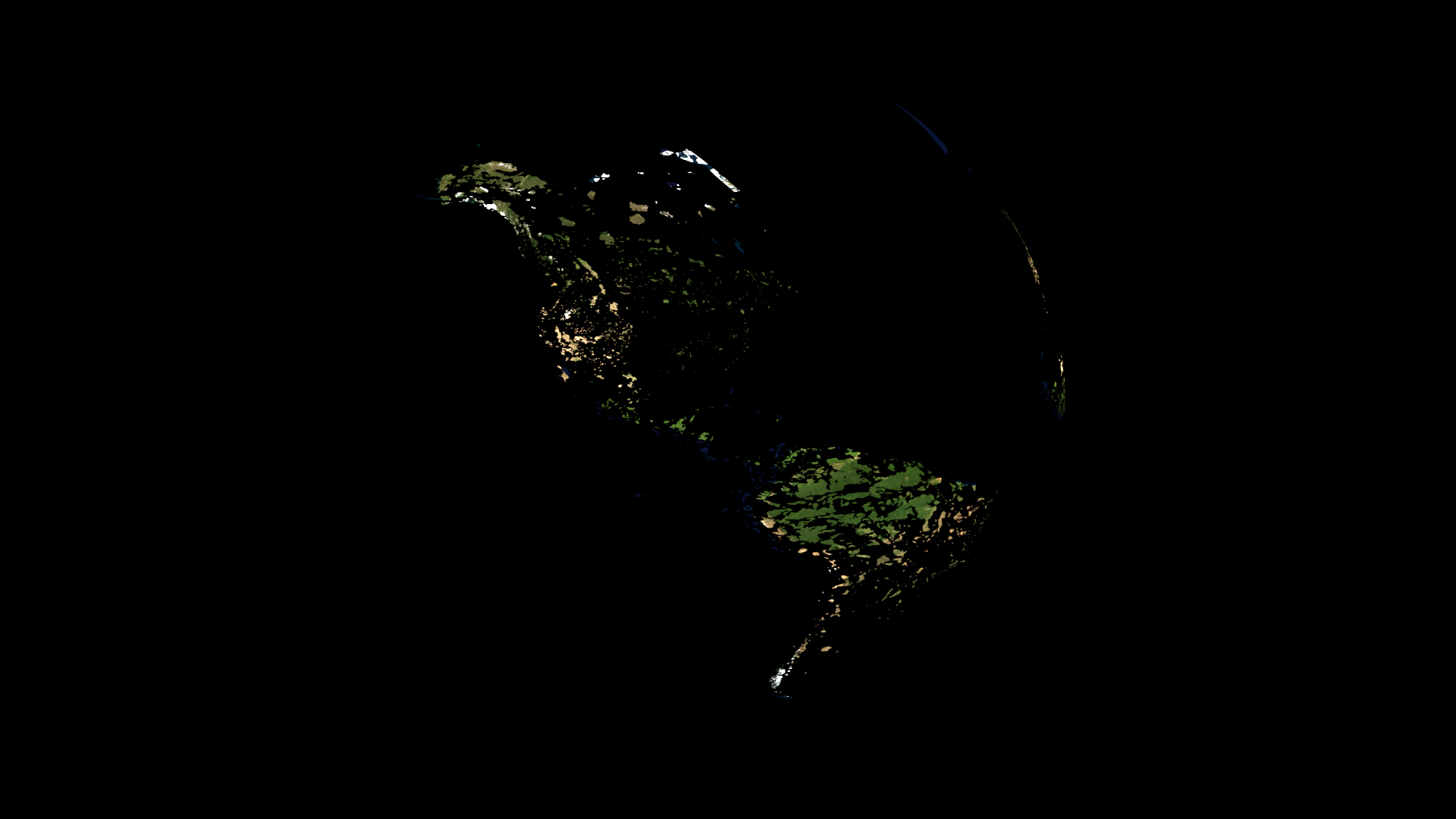
A visualization of what remains when all unprotected areas are erased. Reduced to areas with some form of protection from human exploitation we are left with skeletal fragments of green and blue.
Things Worth Saving Slide Presentation
Video of the the 3D Animation:
Week 5:
Guest Speakers: Josh Begley and Anne Chen
Rough image of protected areas on the earth.
Josh Begley investigates the unseen. Prisons, drone strikes, military bases, NYPD places of interest. There are many blank spots on the map. Creating secrecy creates a blank space that indicates its location. What are the processes that get images removed from google maps.
Anne Chen is mapping the proposed Northern Gateway Pipeline. Unceded Native Lands crossed by the pipeline. 750 miles and ten months spent mapping the pipeline run from the oil producing areas in central canada to the coastline in BC.
Balloon aerial photography!

The tar sands, oil spills seldom get national attention from the press. Native peoples way of life, food security, and livelihood are at stake.
DIY mapping from balloon lifted photography
So I found the data set that I wanted but it’s too big to upload to mapbox! I can load it locally and it looks fantastic. The data comes from protectedplanet.net via the United Nations Environmental Program World Database on Protected Areas.
Here is a screenshot of the data set running locally.
Australia as revealed by areas protected from various degrees of development and exploitation of natural resources.
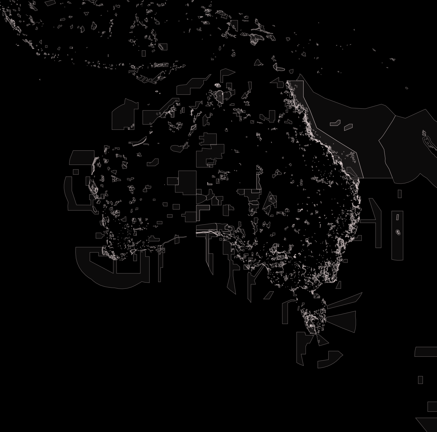
Ideally I would like to make a map that uses this data to only display the parts of a satellite tileset that are protected and display the rest of the map in an industrial gray.
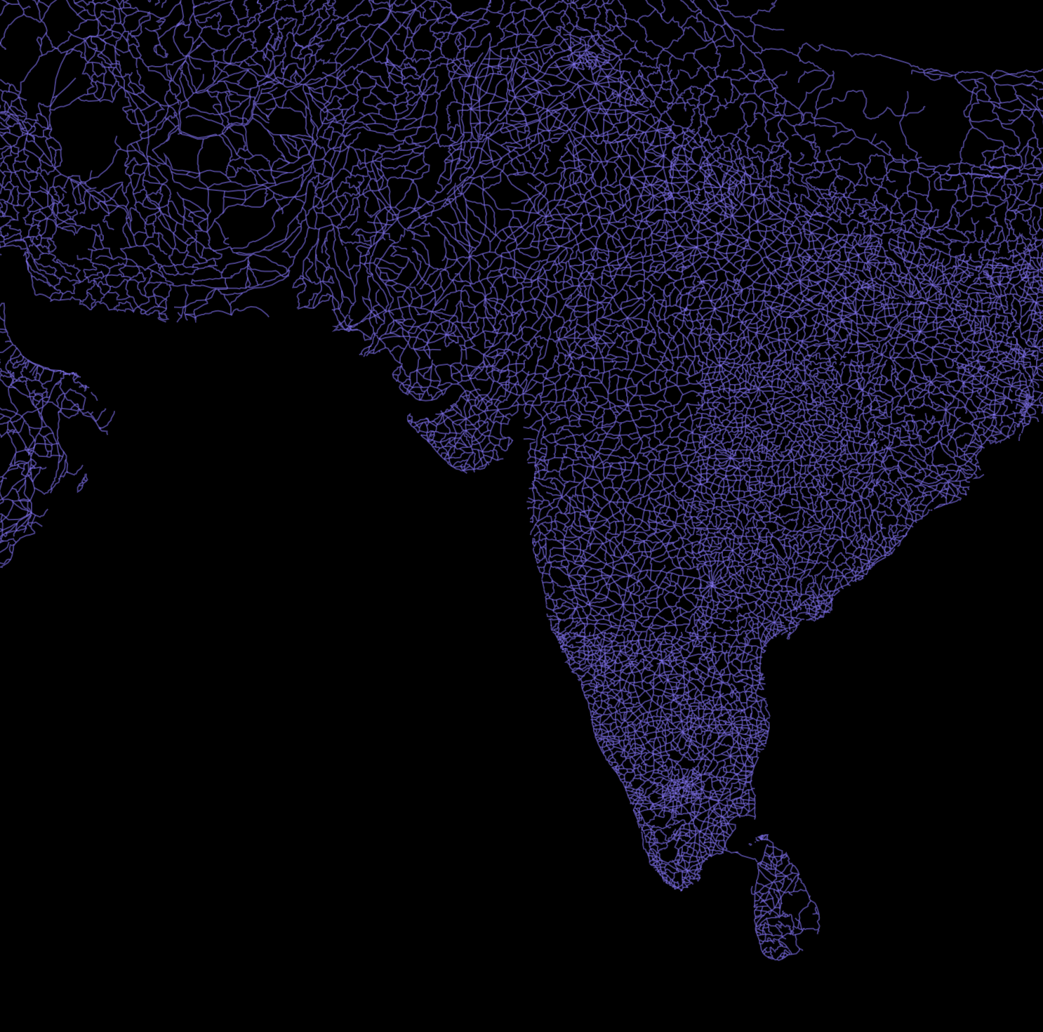
I also located a lovely map of global roads as a shapefile. Reminds me of skeletal leaves.
Some initial ideas for final digital mapping project:
Where ships go to die: ship breakers, ship graveyards, shipwrecks.
Untouched Ecosystems: What is left?
Unesco Sites, increasing in number over time.
Animated Heat Mapping
Week 4:
Using Mapbox Studio Classic.
I was inspired by this image of all the roads in the United States show in black with no other features. This map speaks to how completely we have paved over what used to be open, natural terrain.
I wanted to make a similar map but use a more striking color and set it off against a satellite map, I wanted to illustrate how our love affair with automotive transportation had left patchy islands of green in a sea of red. NYC:
Miami:
Unfortunately, after sinking quite of bit of time trying to get all roads to render at all levels of magnification, I ran into a roadblock that I am still trying to find a workaround for:
No streets rendered above magnification of 12.
Link:
Week 3:
Selective blurring by Google Maps, often by request from governments and private individuals.
Map projections. Math functions that define a transform from spherical to flat. Some things only takes geojson format. CSV to JSON or GEOJSON formatters exist. Be aware of longitude/latitude order between geojson and leaflet.
Getting data => formatting data => displaying data.
Sublime shortcut: highlight text cmd ctrl G will highlight all of it.
CartoDB for huge data sets.
“A choropleth map (from Greek χώρο (“area/region”) + πλήθος (“multitude”)) is a thematic map in which areas are shaded or patterned in proportion to the measurement of the statistical variable being displayed on the map, such as population density or per-capita income.”
I found a complete list of solar installation by state at The Open PV Project. I then converted the list to a CSV file.
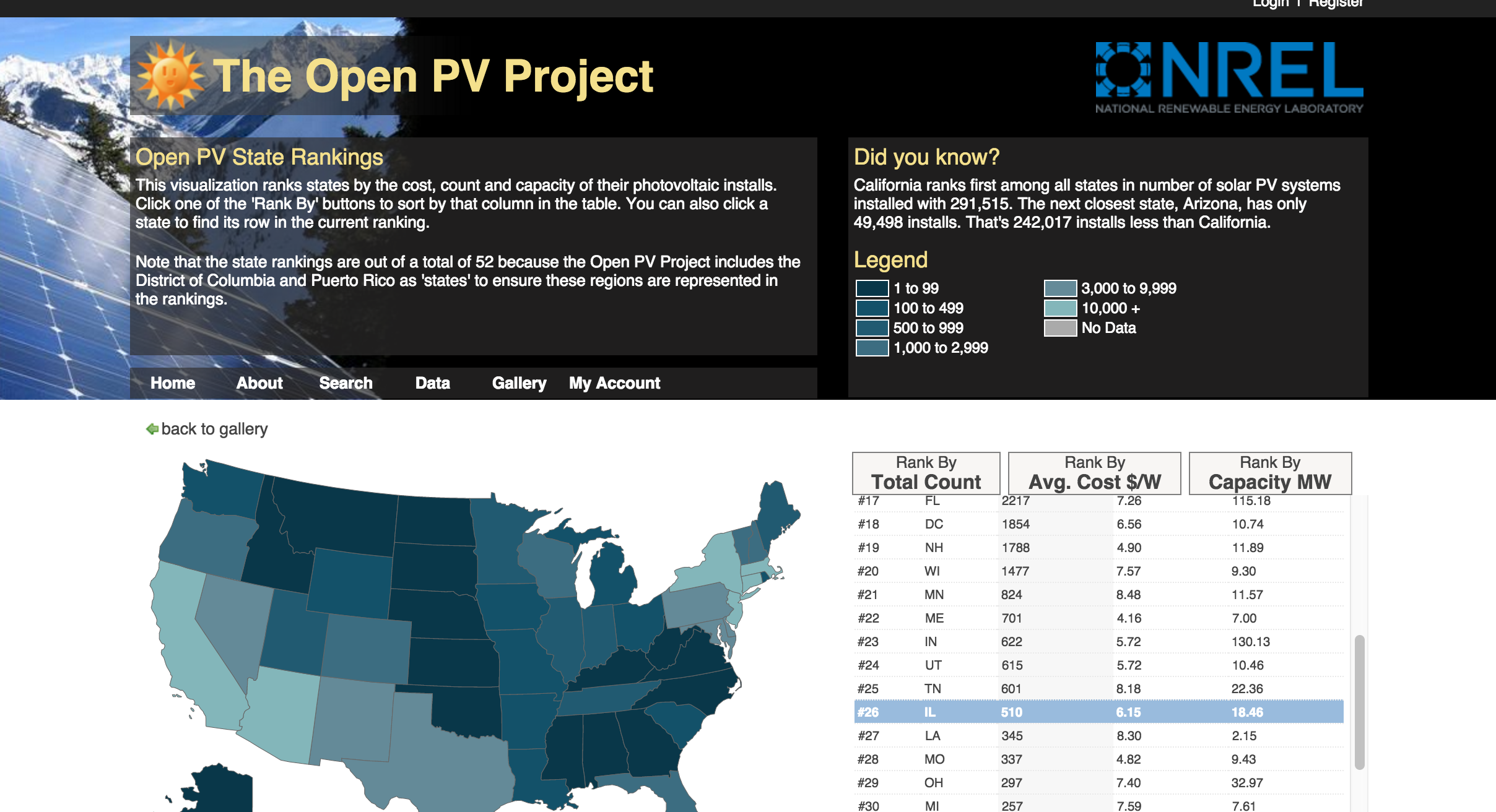
After working through the examples I see that I can get a CSV file into a map easily enough but it only works if there is geospatial data for state outlines, which is a lot of data to wrangle. Enter cartodb.com:
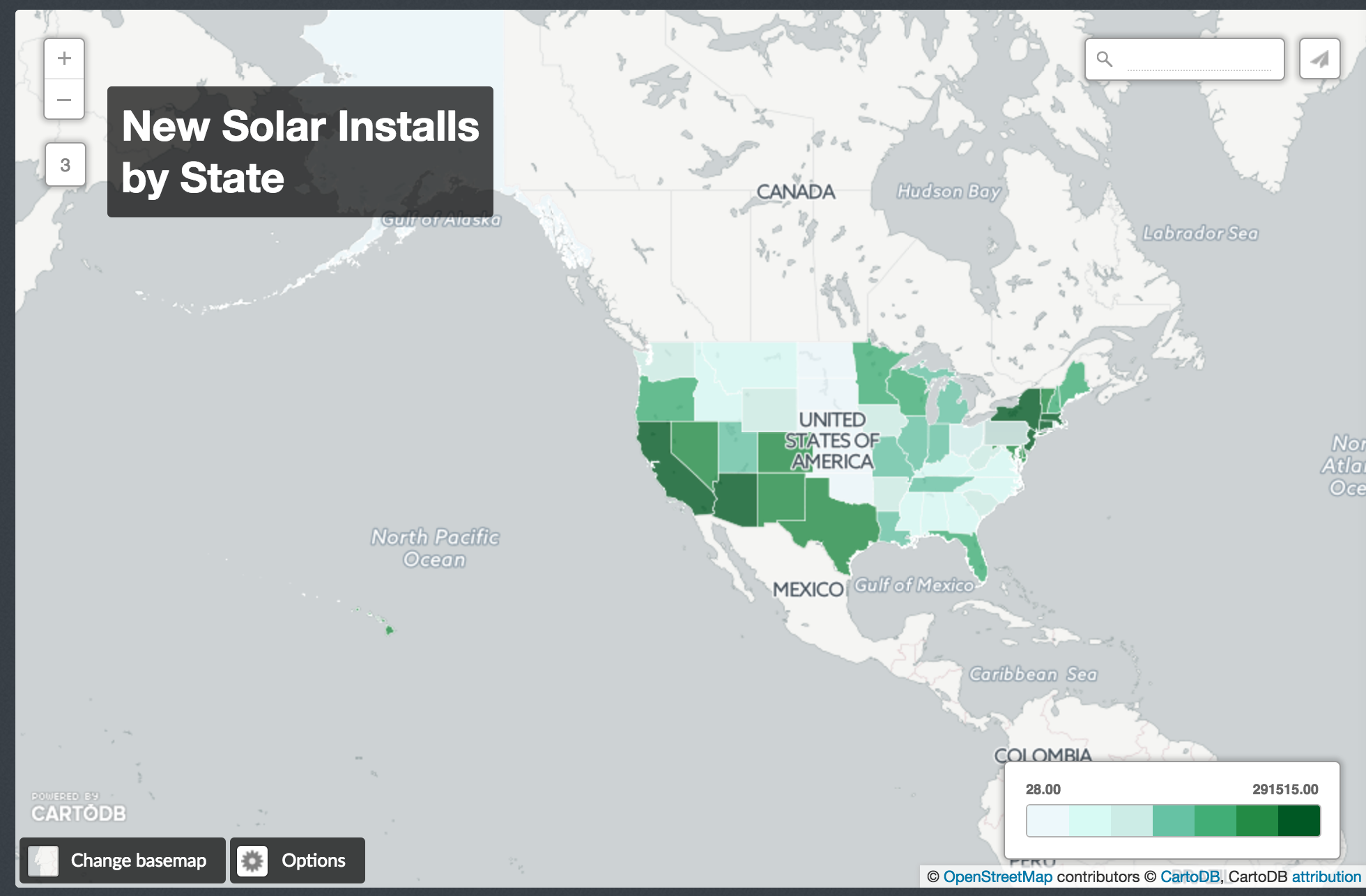
This map shows total solar installations by state. Actual numbers are displayed on mouse click.
Tiles are 256 X 256 pixels.
Tiles are raster images, they render in the browser as PNGs. Browsers will display center tiles before rendering the outer edges.
Slippy map, colloquially maps that can be panned across in the browser.
Zoom levels 0-19, (world – individual houses), tile numbers expand exponentially.
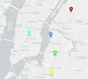
Map markers are can be customized.
Maps as relationships between data.
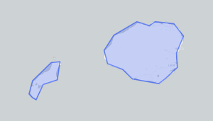
GeoJson is an open standard format designed for representing simple geographical features, along with their non-spatial attributes, based on JavaScript Object Notation. GeoJason files can be added to outline geographic features over leaflet maps.
Homework:
This map shows hikes that I have completed on the island of Kauai.
http://questkennelly.com/mapping/kauai_hikes.html
questkennelly.com/mapping/
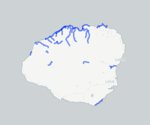
The trails were traced with the geojson.io polyline tool, saved out and reloaded as an external geojson file.
Week 1:
Radical Cartography
Trevor Paglen
Eric Fisher
Mapping as a tool of the powerful, now in the hands of the many.
Homework:
Both maps are of Kauai, Hawaii.
The bottom map is centered on Haena Point and the house that I grew up in.
The top map is centered on the Western end of Waineha Bay and my parent’s current home.
questkennelly.com/mapping/